 After selecting between the pictures I had saved, I decided to choose this picture as models in the picture has a mode of address a which is appropriate as it directly makes eye contact with the potential target market. The background is also clear which makes it easier for the font to stand out without the use of boxes like my previous magazine. This gives it a more professional look. However, I then came to realise that the masthead does not suit my magazine due to the colour scheme. Since I had originally created it on photoshop, I went back to create a more suitable masthead.
Monthly Archives: March 2013
Front cover
This was my first and completed front cover for my music magazine. However, when I came to export the file as a PDF, I found that the main images Original file had been deleted from the computer. As a result, I had to choose another image from my photoshoot to use as my cover image.

Photoshop – Before and After


From my photoshoot, I had to edit the pictures using photoshop. I Had to use different tools such as the crop tool, blur tool and adjusting the brightness, contrast, curves, saturation and levels

Photoshoot


Here I have a selection of pictures to choose from for my double page and front cover.
Masthead Ideas
The fonts I have chosen are mostly Block fonts which has a huge and quick impact as it instantly grabs and draws attention. It will also stand out from the rest of the texts/images on the page.


 This is my second draft.
This was the third draft I created for my mastheads. I have a selection of different colours which are cohesive to the colours used on my front cover after my original picture was deleted. This is because the masthead above is not reflective of the house style.


Potential Magazine Articles
My article is based on the newest winner of the XFactor, Tyler Thompson
Points to consider :
1) New found fame
2) Future plans
3) Xfactor journey
4) Relationships
5) Address rumors
6) Fashion sense
7) Family support
8) XFactor Winners single
9) Concerts/ Tour
10) New album
Sketches : first draft and second draft


Picture Planning
This is my plan for the pictures I will be taking for my magazine which will give me an idea of exactly what pictures I will need. This saves time whilst taking the pictures. 
Masthead ideas
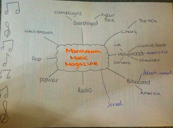
I branched out words which could be associated with my magazine. This will help me create and chose an appropriate name for my magazine.
established,
Flat Planning


This flat planning gives me an idea of particular content which may be included in my magzine. This allows me to create the content page with much more ease.
